Latest Updates
Discover insights, tutorials, and news from meetergo

Alternativen
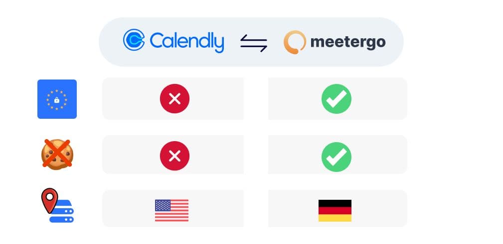
From cal.eu to meetergo: the European alternative
Guides
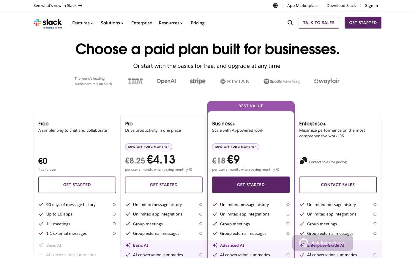
Slack Pricing 2026: All Plans, Costs and Hidden Fees

Sales
What Is Revenue Intelligence? A Guide to Sales Forecasting with HubSpot

Guides
AI Agents for Small Businesses: A HubSpot Guide (2026)

Alternativen
HubSpot Service Hub vs Zendesk: Best Support Tool for SaaS

Guides
CRM Features Small Businesses Actually Need: A HubSpot Guide
Sales
HubSpot Sales Hub & 7 Best Sales Engagement Platforms (2026)

Marketing
Best Email Marketing Tools for 2026: HubSpot & 6 Alternatives

Alternativen